Google
•
2025
A self-directed mobile companion app designed to make Google's Mountain View campus feel personal to every visitor — from first-time guests to longtime Googlers — without a single experience feeling generic.
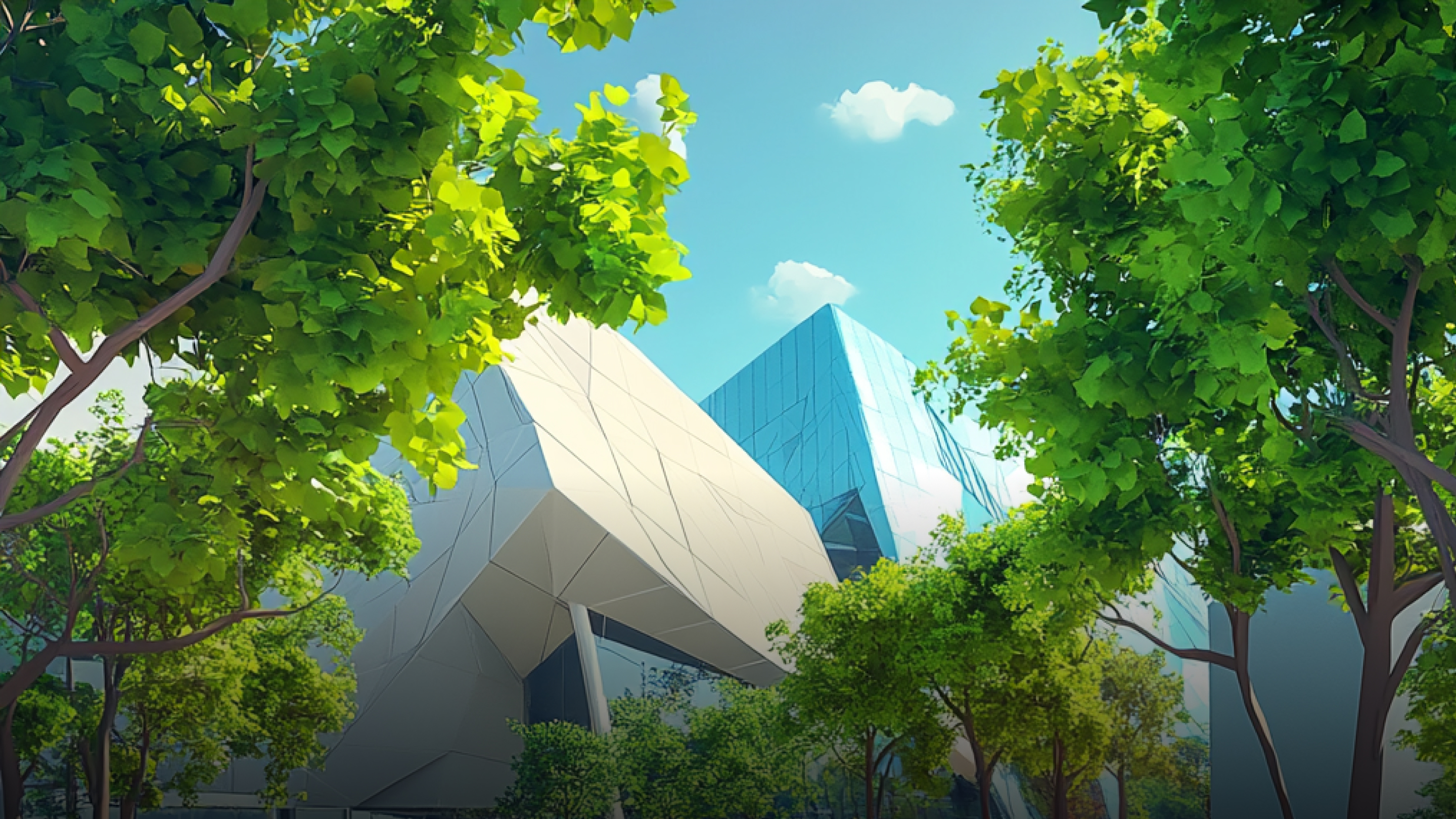
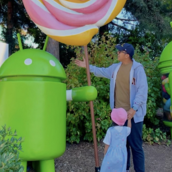
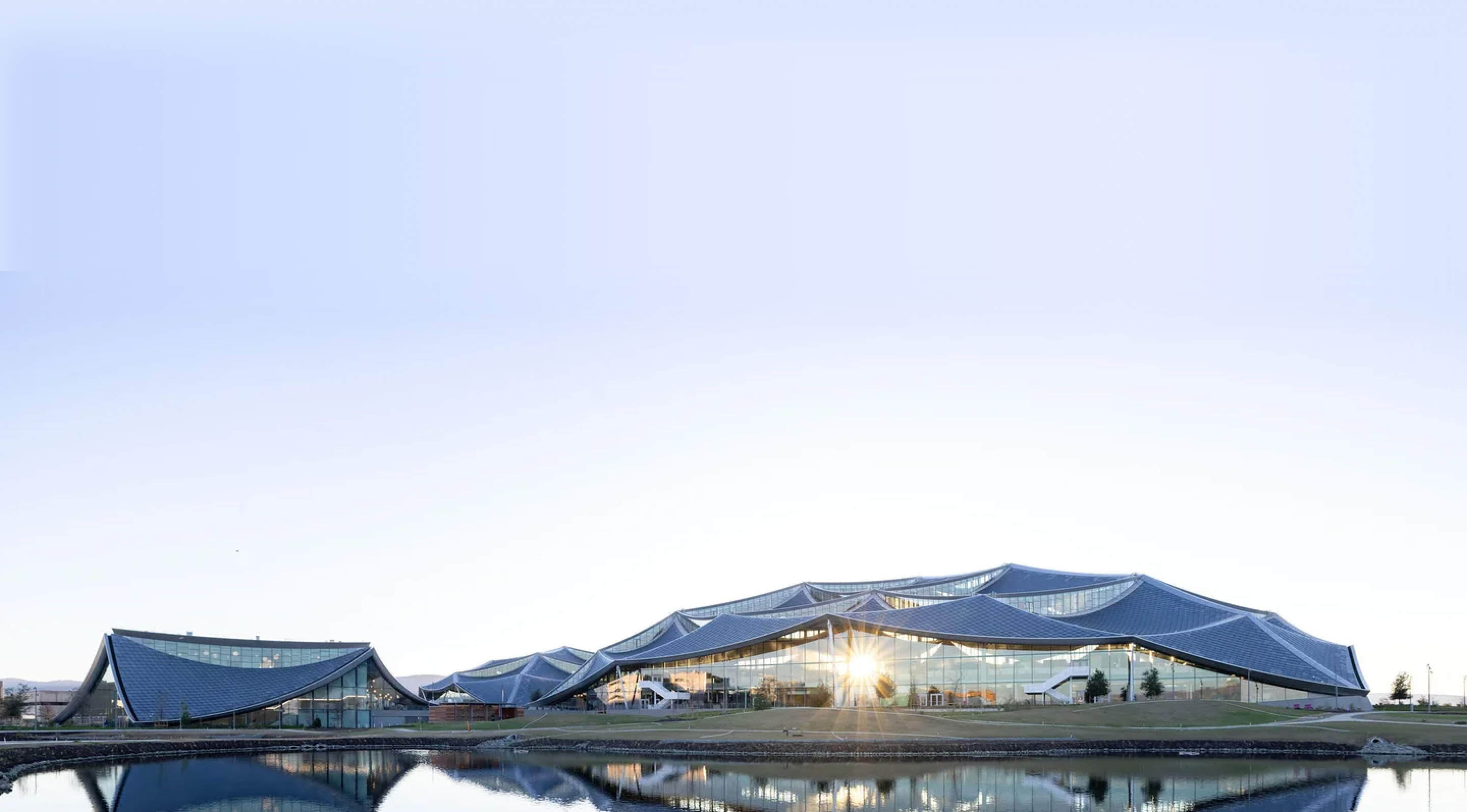
Google's Mountain View campus hosts over one million visitors a year — but every visit was largely the same: a static, undifferentiated walk-through with little connection to the people, ideas, and impact behind the brand.
My agency was invited to pitch a self-guided companion experience that would make each visit feel personal. The goal wasn't just wayfinding. It was to turn the campus itself into a storytelling platform — one that could scale to any visitor type, any tour depth, and any future expansion.

The campus hosts a radically diverse visitor base — each with a distinct relationship to Google and a different emotional need from the experience. The design challenge was building a single system that could meet all three without feeling watered down for any of them.
Children, students, and interviewees. They come seeking inspiration and a felt sense of possibility — what it means to work at a place that shapes the world.
Googlers and their guests. They want connection and a sense of pride — a way to show off the campus and feel meaningfully tethered to its culture and impact.
Neighbors, partners, and adult visitors. They come seeking validation and insight — a window into who Google actually is beyond the brand surface.
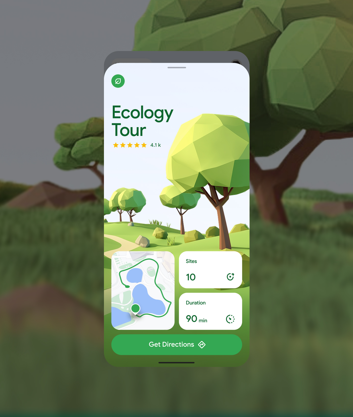
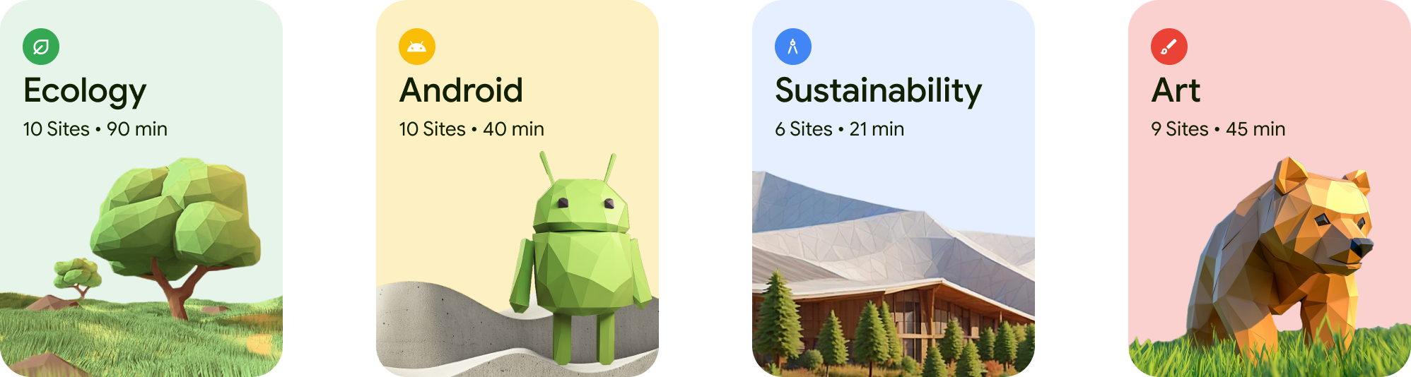
Multiple pathways for discovery catering to different interests and learning styles. Adaptive depth — visitors can engage at whatever level suits them best, from a quick 21-minute sustainability walk to a 90-minute deep ecology exploration.
Inclusive design, intuitive wayfinding, and assistive technology throughout. Language selection at onboarding for native-language exploration. Multi-modal engagement spanning text, audio, and interactive elements.
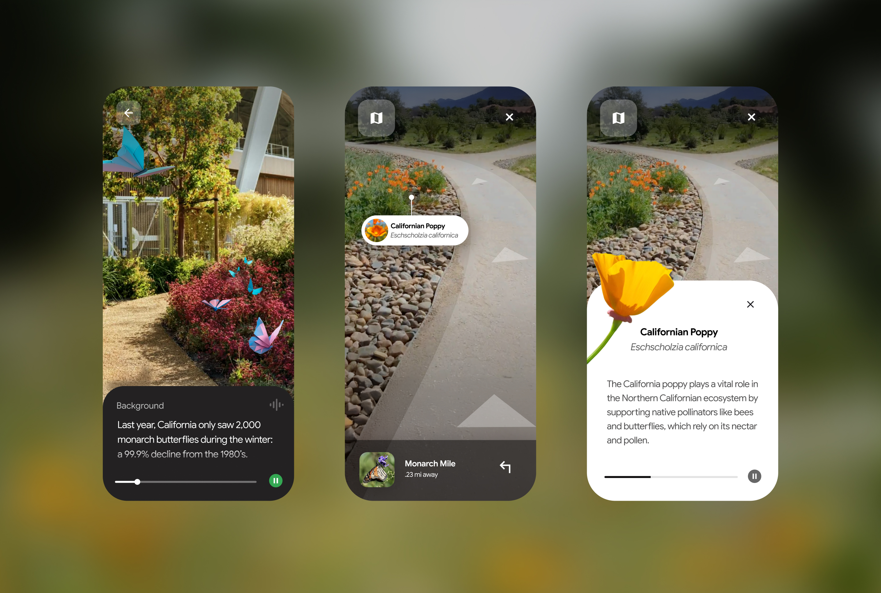
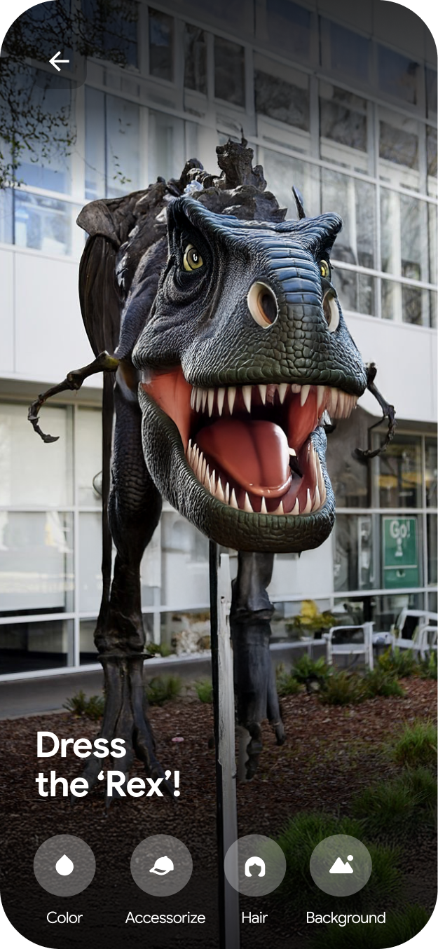
Transform ordinary campus spaces into extraordinary discoveries. Content embedded in the experience end-to-end — not appended as an afterthought. AR, trivia, and badge rewards that create shareable moments of delight.
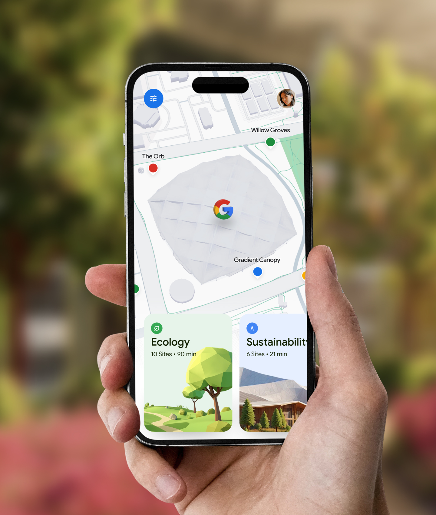
Visitors enter through a QR code on campus signage or a link on visit.withgoogle.com. A language selector at onboarding immediately signals accessibility and sets a welcoming tone. The "Discover the Google Campus" hero establishes the brand register — warm, open, exploratory.
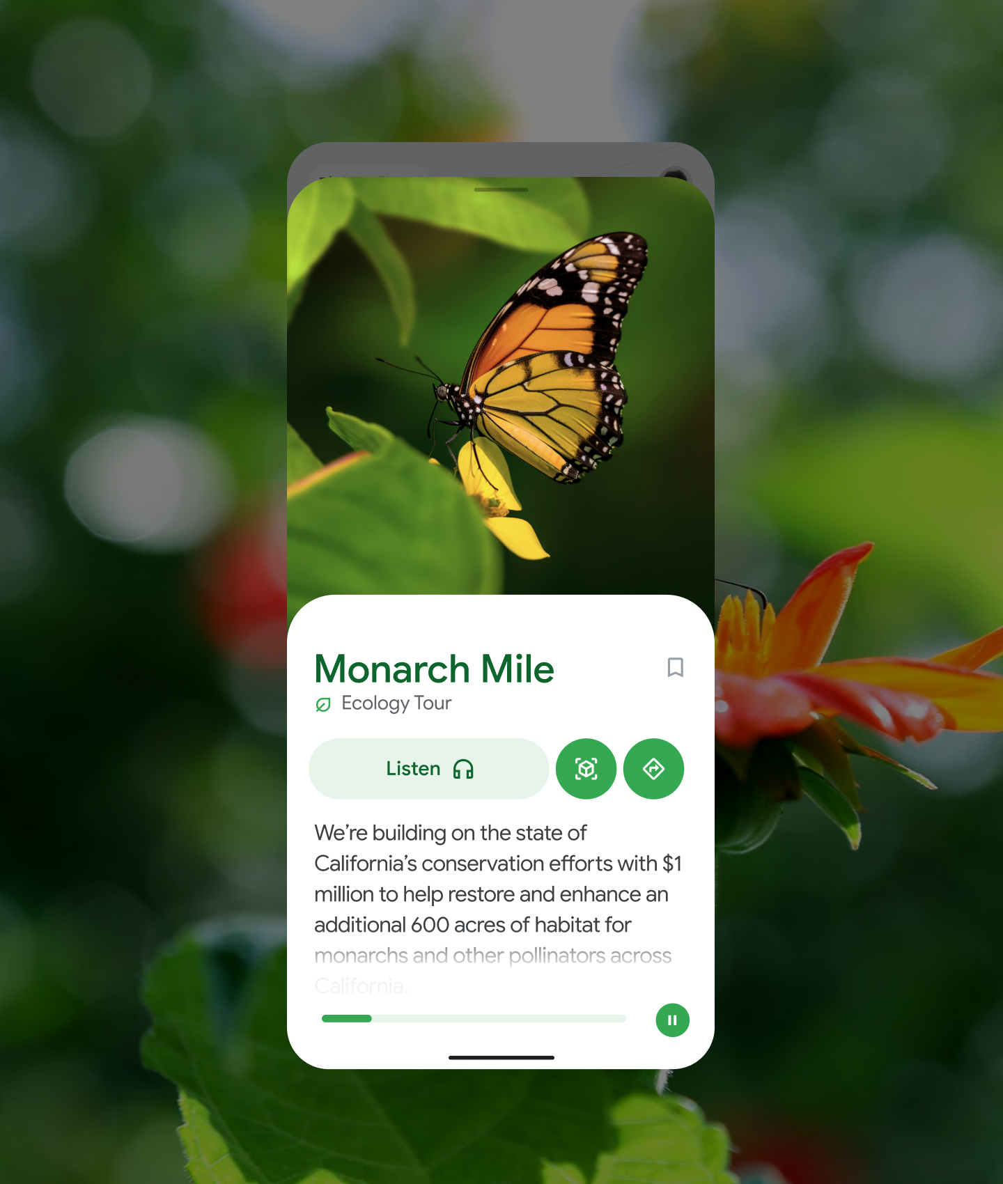
At each stop, visitors unlock a rich content card — real photography, audio guide playback, and AR triggers. The Monarch Mile stop demonstrated the full range: background context, a Listen button for audio, AR and bookmark controls, and a progress bar indicating remaining audio.
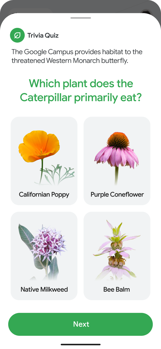
Trivia quizzes placed after key points of interest deepened memory recall and created moments of playful engagement. The badge reward at tour completion — earned, not just given — turned the tour into a personal achievement worth sharing.
We built a proof-of-concept prototype on Google Maps Platform during the pitch — not just to sell the vision, but to prove it was technically grounded and launchable within budget. That combination of creative ambition and engineering reality is what I find most satisfying about product design.
We didn't win — the budget wasn't there — but this was one of the few projects that forced me to genuinely reckon with where physical and digital experience should meet. Where to lean in, and where to pull back, is still something I think about.